Branding
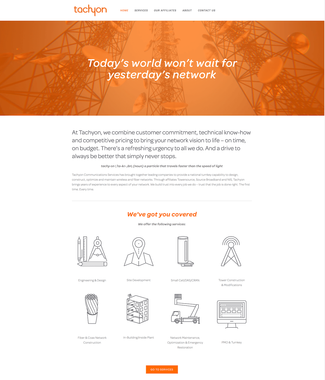
tachy·on \ˈta-kē-ˌän\ (noun) a particle that travels faster than the speed of light
When cable and network implementation expert Source Broadband decided to merge with Towersource and NIS to create a new unified group of network utilities, they came to Realm to create a new brand and identity for the group. We named the group Tachyon.
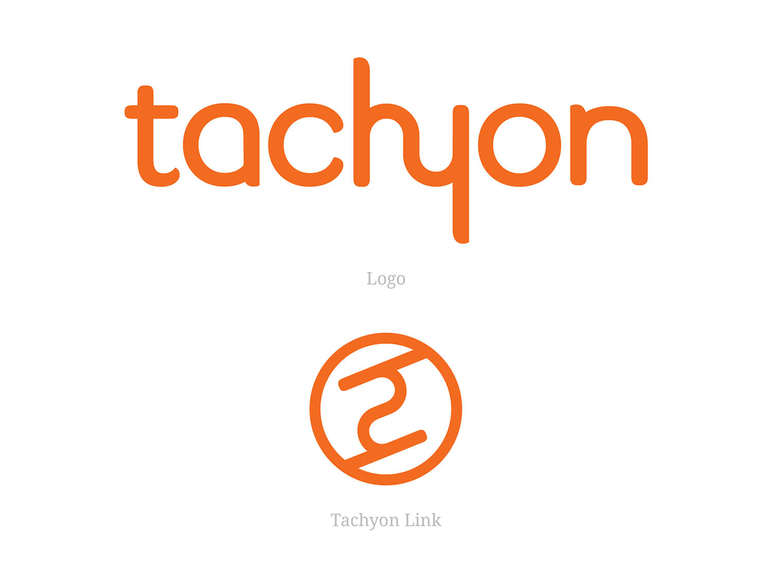
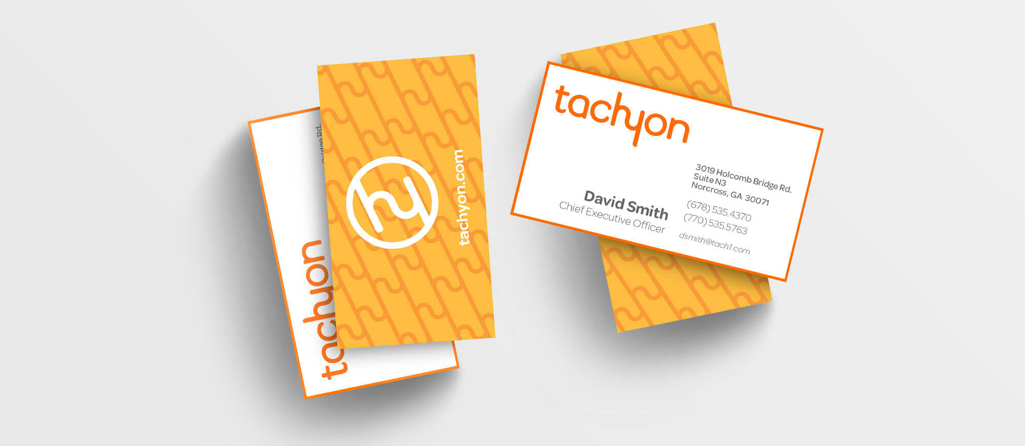
Tachyon needed a brand identity that signified their ability to bring connections to the world around them, faster than anyone else in the field. I started with the Tachyon logo, with the unified hy glyph, and included the alternate mark that we deemed the Tachyon Link.
Familial Features
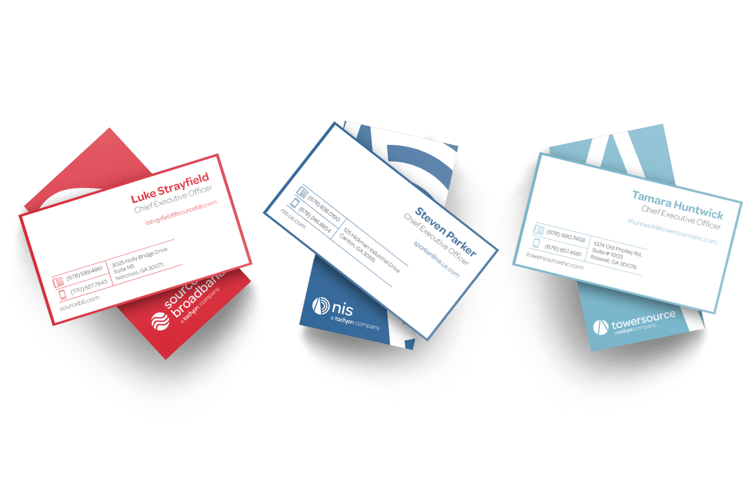
Because this merger was bringing together three industry powerhouses, I also created identities for Tachyon’s child companies — Source Broadband, NIS and Towersource. Sticking with the Tachyon typeface and alluding to the Tachyon link’s circular mark, I created an iconographic logo for each company that abstractly represented their specific skills in network deployment.

